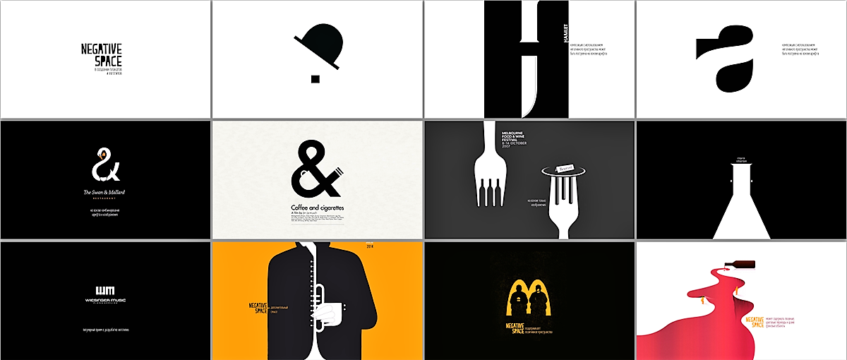
Negative space, often referred to as “white space” in design, is the area around and between your visual elements. It might seem counterintuitive, but negative space is just as important as the elements themselves. Used effectively, negative space can enhance your design’s clarity, hierarchy, and overall impact.
Why is Negative Space Important?
-
Improved Readability: By creating space between elements like text, images, and icons, you improve readability and guide the viewer’s eye through your design. Too much clutter can overwhelm viewers and make it difficult to understand your message.
-
Emphasis & Focus: Negative space can be used to draw attention to specific elements. Surrounding an important call to action with ample negative space makes it stand out and encourages user interaction.
-
Balance & Harmony: Negative space helps create a sense of balance and visual harmony in your design. It prevents your composition from feeling cluttered or overwhelming.
-
Respiration & Breathing Room: Negative space provides a sense of “breathing room” in your design. This allows viewers to take in the information visually without feeling bombarded.
Mastering Negative Space:
-
Consider the Hierarchy: Use negative space strategically to create a visual hierarchy. Important elements should have more breathing room compared to less crucial details.
-
Balance & Symmetry: While asymmetry can be effective, using negative space to create a sense of balance is often a safe bet. Aim for a visually harmonious composition.
-
Grid Systems: Grid systems provide a framework for organizing your design elements. Using negative space within the grid helps ensure consistent spacing and visual balance.
-
White Space is Not Empty Space: Don’t be afraid to embrace generous white space. Think of it as a canvas that allows the other design elements to shine.
Negative Space in Action:
Look around at some of the most successful brands and websites. Apple, for example, is renowned for its minimalist approach, utilizing ample negative space to create clean and user-friendly interfaces. Similarly, Swiss Style graphic design is known for its emphasis on negative space, resulting in timeless and impactful visuals.
By understanding the power of negative space and implementing these tips, you can elevate your designs, improve user experience, and create a lasting impact on your audience.
Do you have any design projects where negative space played a key role? Share your experiences in the comments below!