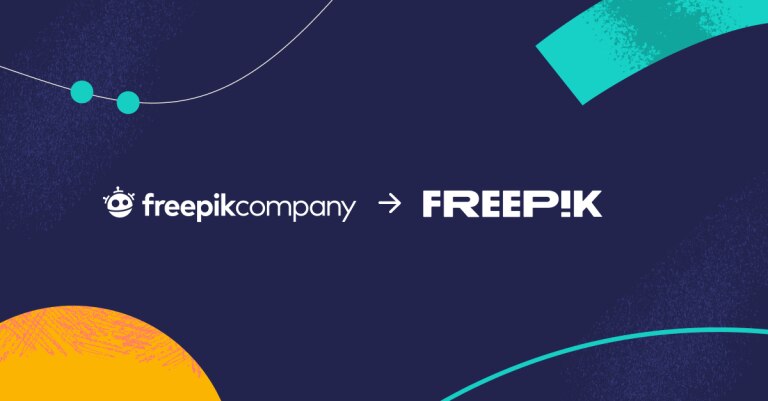
Freepik, the global tech company and world’s largest platform of audio-visual resources, recently announced its rebrand. Freepik partnered with the San Francisco-based and award-winning creative advertising agency, Partners in Crime, to develop its new visual identity and positioning.
The rebrand is designed to reflect Freepik’s evolution from a stock photo and vector website to a comprehensive platform that empowers anyone to create great designs faster. The new visual identity is centered around the concept of “creativity for all,” and it features a bold new logo, a vibrant color palette, and a playful and energetic tone.
The new logo is a simplified version of the original Freepik symbol, with a focus on the letter “P.” The “P” is now a single, bold line that represents the power of creativity and the endless possibilities that Freepik offers. The new color palette is inspired by the coastal city of Málaga, Spain, where Freepik is headquartered. The bright and vibrant colors reflect the energy and creativity of the Freepik brand.
In addition to the new visual identity, Freepik is also launching a new positioning statement: “Great design, faster.” This statement reflects Freepik’s commitment to helping its users create high-quality designs quickly and easily.
The Freepik rebrand is a significant milestone for the company. It represents Freepik’s commitment to innovation and its continued focus on helping people create great designs.
Here are some of the key takeaways from the Freepik rebrand:
- Creativity for all: The new Freepik brand is centered around the concept of “creativity for all.” This reflects Freepik’s belief that everyone should have access to the tools and resources they need to be creative.
- Great design, faster: Freepik’s new positioning statement is “great design, faster.” This reflects Freepik’s commitment to helping its users create high-quality designs quickly and easily.
- New visual identity: Freepik’s new visual identity is bold, vibrant, and playful. It features a simplified logo, a vibrant color palette, and a playful and energetic tone.
Overall, the Freepik rebrand is a positive step for the company. It reflects Freepik’s commitment to innovation, its focus on creativity for all, and its mission to help people create great designs faster.
