
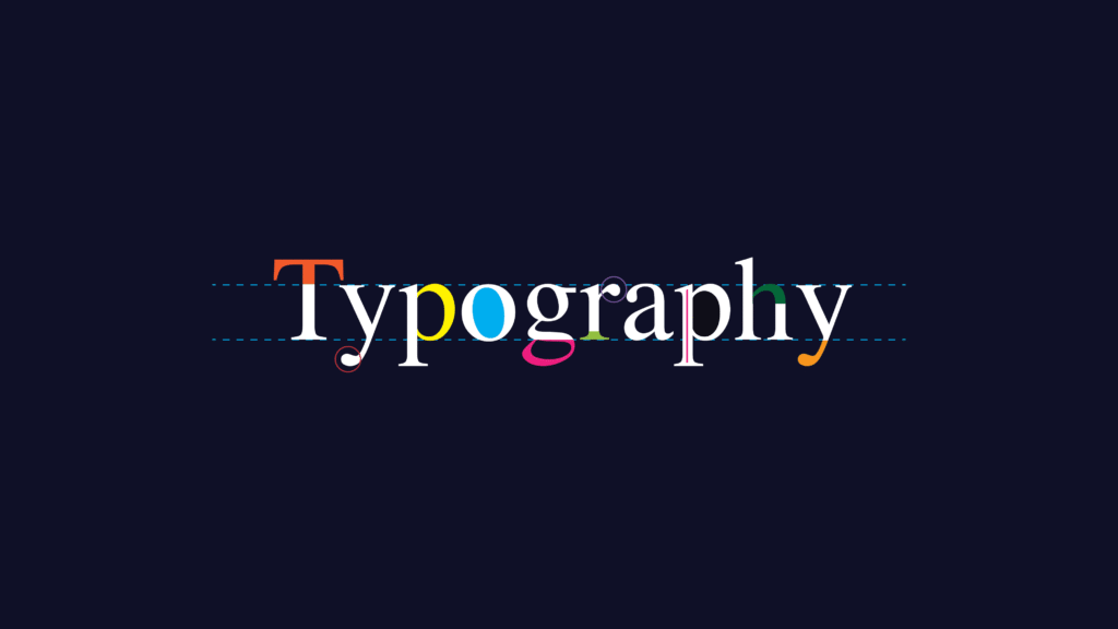
If design is the body of a brand, typography is its voice. It’s how a brand speaks visually — serious or playful, elegant or bold, minimalist or expressive. Choosing the right typography is one of the most impactful decisions a designer can make.
Why Typography Matters in Branding
- Establishes Personality
Fonts evoke emotions. Serif fonts suggest tradition and trust. Sans-serifs feel modern and clean. Scripts are expressive and human. - Drives Consistency
A brand with three different typefaces across social media, website, and print feels disorganized. A clear type system builds recognition and trust. - Boosts Readability
Strong typography balances aesthetics with accessibility. It ensures the message is not only stylish but also easy to consume.
Best Practices in Typography for Brands
- Limit Typefaces
Stick to two or three fonts: one for headings, one for body text, and maybe an accent. More than that feels cluttered. - Create a Hierarchy
Define styles for H1, H2, body, captions, etc. Consistency makes everything look professional. - Consider Versatility
Choose fonts that look good across web, print, and motion graphics. - Test Across Devices
A font that looks sleek on desktop might be hard to read on mobile. Always test.
Examples in Action
- Apple uses clean, sans-serif typography to emphasize minimalism and modernity.
- The New York Times sticks to classic serif fonts, reinforcing its authority and heritage.
- Coca-Cola uses a script font, making its brand feel timeless and expressive.
Final Thoughts
Typography isn’t decoration — it’s identity. The right choice communicates values, sets tone, and builds recognition. Treat typography with the same care as a logo or color palette, and you’ll craft a brand voice that lasts.