Graphic design is a visual language that uses elements like shapes, colors, and text to communicate ideas. It’s all around us, from the logos we see on our favorite products to the websites we browse every day. But what makes good graphic design?
There are a few key principles that every graphic designer should know. These principles can help you create designs that are clear, effective, and visually appealing.
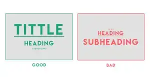
1. Hierarchy
Hierarchy is about organizing the elements of your design in a way that makes it clear what’s most important. The most important element should be the most prominent, and the less important elements should be less prominent.
You can use hierarchy to create a sense of order and flow in your design. For example, you might use a larger font size for a headline than for body text.
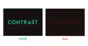
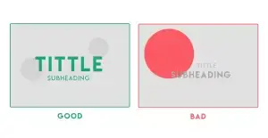
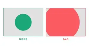
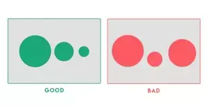
2. Contrast
Contrast is about using differences in elements to create visual interest. You can create contrast with color, size, shape, texture, and more.
Contrast can be used to draw attention to certain elements of your design. For example, you might use a bright color against a dark background to make a button stand out.
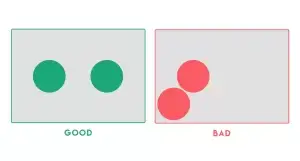
3. Balance
Balance is about creating a sense of visual stability in your design. There are two main types of balance: symmetrical and asymmetrical.
Symmetrical balance is created when the elements of your design are mirrored on either side of a central axis. Asymmetrical balance is created when the elements of your design are not mirrored, but they still feel visually balanced.
4. Emphasis
Emphasis is about using visual cues to draw attention to the most important element of your design. You can use emphasis with color, size, shape, position, and more.
Emphasis can be used to call to action or to make sure that viewers see the most important information.
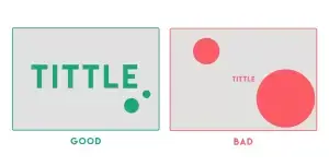
5. White space
White space is the empty space around the elements of your design. It’s important to use white space to give your design breathing room and to prevent it from feeling cluttered.
White space can also be used to create emphasis. For example, you might use a lot of white space around a call to action to make it stand out.
6. Repetition
Repetition is about using the same elements or patterns throughout your design. Repetition can create a sense of unity and coherence.
Repetition can be used to create a brand identity or to make your design more memorable.
7. Proportion
Proportion is about the relationship between the different elements of your design. The elements of your design should be in proportion to each other so that they look harmonious.
Proportion can be based on mathematical ratios, such as the golden ratio.
8. Movement
Movement is about creating a sense of visual flow in your design. You can create movement with lines, shapes, and color.
Movement can be used to guide the viewer’s eye through your design.
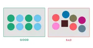
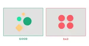
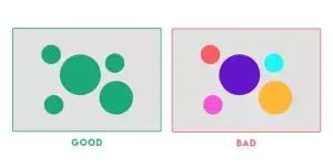
9. Variety
Variety is about using different elements in your design to prevent it from being boring. You can create variety with color, size, shape, texture, and more.
Variety can make your design more interesting and engaging.
10. Unity
Unity is about making all of the elements of your design work together as a whole. All of the elements of your design should have a common theme or purpose.
Unity can help to make your design more effective.
These are just a few of the many graphic design principles that you can use to create effective designs. By following these principles, you can create designs that are clear, effective, and visually appealing.
Remember, there are no hard and fast rules in graphic design. The most important thing is to use your principles to create designs that you’re happy with.
I hope this blog post has been helpful. If you have any questions, please feel free to leave a comment below.
Thanks for reading!