Color is everywhere in our world, and it has a profound impact on how we perceive things. In graphic design, choosing the right color palette is crucial for branding – it sets the tone, evokes emotions, and creates a lasting impression of your business.
Why is Color Important in Branding?
Think about some of the most recognizable brands in the world. Coca-Cola’s red, McDonald’s golden arches, and Tiffany & Co.’s signature blue – these colors instantly bring the brand to mind. Color is a powerful tool for brand recognition and recall.
Beyond recognition, colors also have psychological associations. Red is often seen as bold and energetic, while blue is associated with trust and security. Green evokes feelings of nature and growth, while yellow is linked to optimism and happiness.
By carefully selecting your brand colors, you can communicate your brand values and personality to your audience.
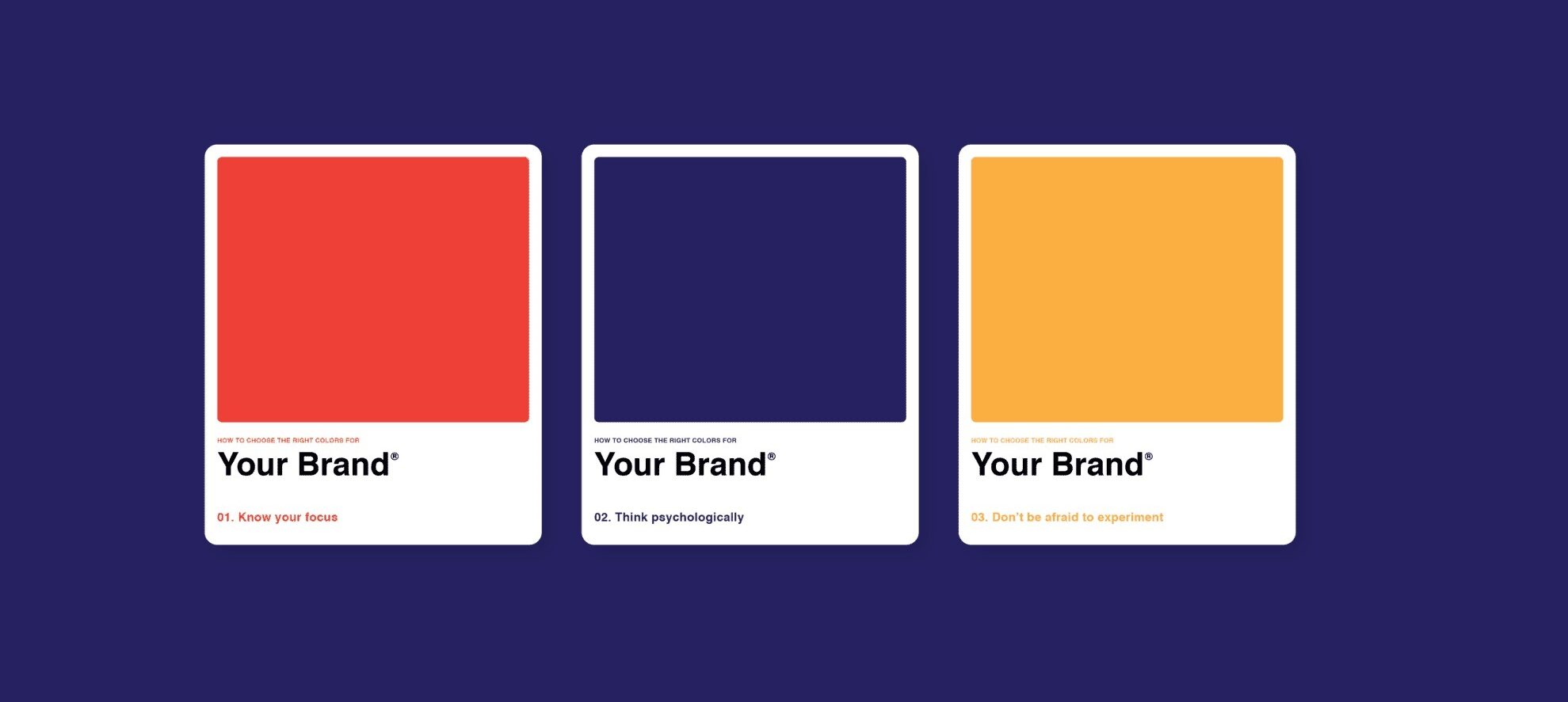
Choosing Your Brand Colors:
Here are some steps to consider when crafting your brand color palette:
- Understand your brand: What are your brand’s core values and target audience?
- Research color psychology: Learn how different colors can influence emotions and perceptions.
- Look for inspiration: Draw inspiration from successful brands in your industry or complementary fields.
- Limit your palette: Stick to 2-3 main colors for consistency, with additional accent colors for variety.
- Test and refine: Experiment with different color combinations and gather feedback before finalizing.
Remember: There’s no one-size-fits-all approach to color in branding. The key is to choose a palette that reflects your brand’s unique identity and resonates with your target audience.
Bonus Tip: Consider how your colors will translate across different mediums – print, digital, and physical products – to ensure brand consistency.